Aloe polyphylla Schönland ex Pillans by Flickr user brewbooks. Click image to view source.
End matter or back matter is a book publishing term that describes all the written elements of a book to be dealt with after the author has finished writing the manuscript. These may include indexes, appendices, glossaries, the table of contents, notes, bibliographies, and so on.
As a gallery artist, I have learned to do a lot more legwork besides making the paintings. I have come to think of certain tasks as the end matter -- what remains to be done after the art is finished. The more of this work I do myself, and do well, before delivering my work to a gallery, the better my professional standing.
Following is some end matter I'm faced with before a gallery show.
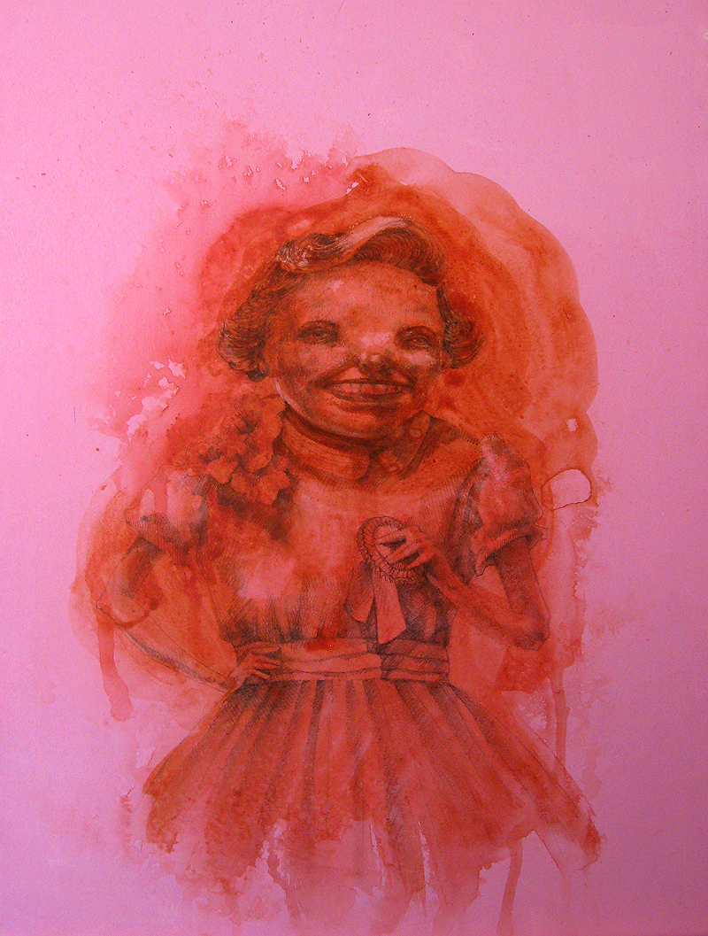
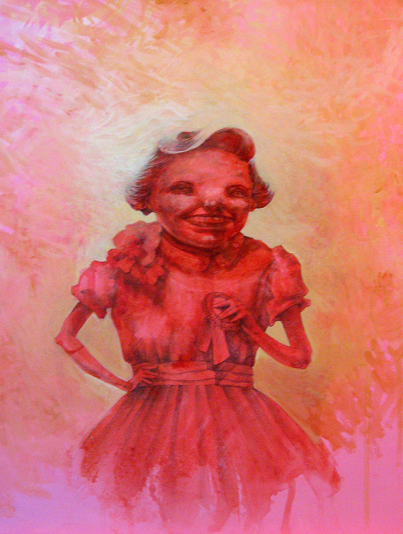
Sign and date the work. Sometimes, as with the Normal series, I include a story on the back of the piece. Information like this can increase a painting's value and provenance.
Prepare the painting for hanging in the gallery, either by wiring or framing. I highly recommend Downtown Art & Frame in Norman, OK.
Attach a business card or other identifying information to the back of the piece. This is especially important for group shows where your work might be misidentified.
Photograph the piece. That is, take a good photo, not one with uneven lighting, or glare, or out of focus, etc. The digital formats I use most often are:
300 dpi, 1,000 pixels on a side (for print)
300 dpi, 4 x 6 inches or thereabouts (for print or application to juried shows)
72 dpi, 500-800 pixels on a side (for the web)
72 dpi, 150 pixels on a side (for thumbnails)
Make a backup of the photos, on cd, on the home server, etc.
Upload the image to my website, Flickr, Facebook, etc.
Add the piece to my portfolio, if it's among my best works.
Add the piece to my inventory. I'll post more on this later.
Register the work with the copyright office. I keep a text file with an ongoing list of all the works I complete, called "Works By Date." When I finish a piece (or scan a batch of sketchbook pages), I add it to the list. I also keep a folder of small images at 72 dpi, which I will submit as a batch with my copyright registration. When I'm on top of things, I register my work four times a year.
Create an inventory for the gallery. This is so underrated. I make the inventory in two formats:
A spreadsheet containing the title and dates of the show, then the title, medium, dimensions, year, and price for each piece. At the bottom of the spreadsheet I list the show drop-off and pick-up dates, with space for my initials and the curator's. I print two copies: one for me, one for them.
A visual inventory with thumbnail images of each work in the show, followed by titles and prices. (Again, I print two or more copies, and file one for my own reference.) This helps whomever hangs and labels the show, and can also facilitate sales. When a potential buyer calls the gallery asking for the price of a piece, they may only remember it as "That yellow one, with the guy, and that thing in the corner." Having a visual inventory on hand can help avoid all sorts of confusion.
I've learned to leave myself a few days before my deadline to tie up these loose ends. When it's time to ship or deliver my work, I feel much better having all these ducks are in a row.
This post is part of NaBloPoMo for July 2009.


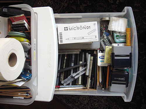 The Pen Drawer.